


What benefits adding an explicit width and height to an image?
You might have seen the warning “Image components do not have specified width and height” on a website if you ran it through Google Lighthouse, Page Speed Insights, or a similar tool. Let’s look at the explicit width and height of the image on the blog or website page.
How does the lack of explicit width and height data in an image or video affect page performance?
Because images and videos are not included with height and width attributes, they are usually downloaded by default to their original size. It can slow down the loading of a page because the browser waits until the image or video is completely downloaded before it determines its size and allocates space for it.
When the browser loads thumbnails of these images on your page, your page content may shift about because the browser is stretching or shrinking the image to fit the thumbnail size.
Layout shifts caused by unsized graphics can hinder users’ navigation of your site.
Layout shifts caused by the un-sized images and videos affect how users interact with your webpage.
Users find it difficult to understand what they should do with an image if it is not sized correctly.
When images are too large or small, they can cause the page layout to shift. It is frustrating for users who want the layout to be consistent.
For example, placing an image within a text will shrink when the text size increases, even if it is labeled block level. It effectively pushes the text down and makes some of the content unreadable. Avoid this by making sure your images are the right size in pixels.
What is the effect of applying height and width attributes to an image?
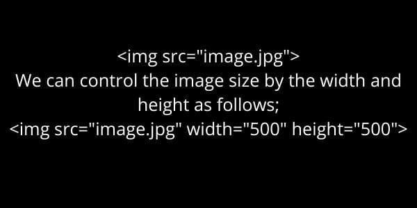
You can apply the height and width attributes image element you used in your HTML. In this way, you can control how big an image is on a page.
The height attribute is a mandatory attribute for all images; it specifies the height of an image in pixels. If you don’t define this attribute, browsers will load images at their maximum size, which might not meet your needs.
To specify how wide should display an image on a page, set the width attribute; prevent browsers from loading images at their maximum width, define their widths and height.
Changing Width and Height Distort Image
Changing the width and height attributes on an image is common in eCommerce, but this approach also has certain limitations.
You can use the image tag to embed it on the web. The src attribute specifies in HTML the displacement of the image.
The width and height attributes allow the dimensions of an image to be specified using pixel values or percentages. This flexibility lets you resize images to fit your website exactly as you want them to appear.
However, you shouldn’t just go changing those attributes willy-nilly as there are limitations; for example, changing only the width attribute distorts an image, while changing both features does not affect the picture.
Fix Image | Explicit Width and Height
Method One
The width and height attributes do what they say. The width attribute controls the image’s width, while the height attribute controls the size of the picture.
Method Two
When you are working with images, the most common way to use these attributes is to assign them a value equal to the actual size of your image. For example, if you were to add a 600 × 400-pixel resolution picture, you would set the width and height attributes to 600.
TIP: If you want your images to display their actual size on all devices, you can use an asterisk (*) as a value for your width or height attribute. This makes them immune to being resized by a user’s browser.
One way to avoid a layout shift is to set the image height as a percentage of the image width. For example, we might give the image zero pixels for size and then add a padding-top to see the entire picture.
This is a pretty clever hack, but it requires you to use a background image on your div.
It’s better to use images for decoration because people who need assistance with visual accessibility or have images turned off can’t see the alt text. If you are concerned about keeping your HTML clean, divs may be a good option. I don’t think they offer compelling advantages, but some people prefer them.
When you’re unsure of an image’s dimensions, there are some things you can do to find them.
The above methods each have a problem. To calculate the aspect ratio while designing the page, you must first determine the image’s width and height. And to add the proper width and height while creating the page, you must first select the image’s aspect ratio.
The answer here is to use caching to remember the dimension information for each image, but this isn’t always feasible.
You have to put some extra work if you’re working with thousands of images on an existing site, or if you can’t get the image’s width and height, etc.
Container with a height set
All images on your blog or site should have an aspect ratio (the relationship between the image’s width and height) between 1:1 and 16:9.
One possible solution is to wrap all of our images in a container with a fixed height. Because of this, the browser can give space for the container rather than the picture.
The downside is that if you use images with different aspect ratios. You will have space at the bottom of your container. Because images with comparable aspect ratios are better suited to scrolling. This method works best when your pictures have similar ratios.
Modern Browsers | Explicit Width and Height
Modern browsers automatically calculate the default aspect ratio for an image if you set width and height. However, if you want to prevent any layout changes, providing the image’s original width and height is still good.
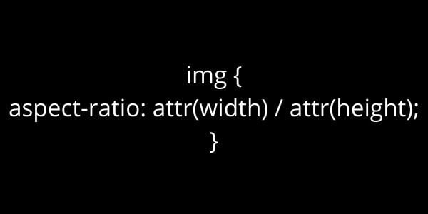
This code checks whether the image has loaded at the beginning of a layout calculation. If not, it computes an aspect ratio based on the image’s width and height. When you set the width of an image to 100%, the element’s size is determined using this aspect ratio.
Responsive Images
When working with responsive images, srcset indicates which image the browser may choose from and of what size it should be. All responsive pictures should have the same aspect ratio to specify their width and height properties.
Bottom Line
To summarize, you should make efforts to avoid Cumulative Layout Shift as much as possible to preserve your Search Engine Rankings. And create a smooth user experience. For 99 percent of cases, all you need to do is add the width and height attributes. In order To fix the explicit width and height of image elements problems. If you are using art direction, consider adding media queries and the padding hack or utilizing the fixed height container technique.